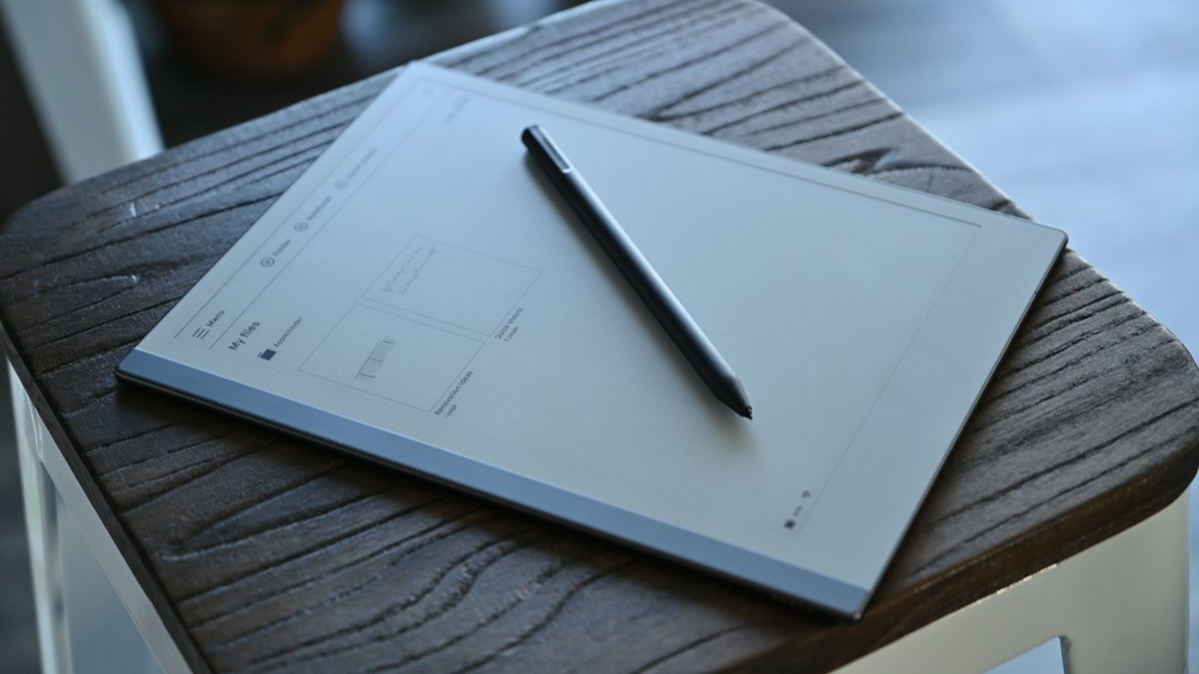
If you are a student or a copious notetaker, Apple’s iPad isn’t the best device for the task, but the reMarkable 2 is an exceptional note-taking experience, lacking any other tablet features.
Taking notes is a legitimate issue for many, spanning high school to college, office life, interviews, and everything in between. There’s been a few common issues that crop up, from managing notes to just making out what the heck we’d written in the first place.
As tech-prone users, we’ve always been inclined to take our notes digitally. We remember using early iPads and a generic rubber-tipped stylus to jot down chicken scratch for use later. It never seemed to go well. Palm rejection wasn’t great in the early days, and the squishy tips weren’t up to the task. Not to mention, the iPad’s screen always felt too small.
We’ve tried out plenty of options, including notebooks you can scan, other “smart” tablets for taking notes that fell short, and high-end styluses for our iPad, and when it came to note-taking, it was never ideal. Even when Apple got serious about notes and drawing by introducing the Apple Pencil.
Currently, we still take a lot of notes which led us to pick up the reMarkable 2 tablet.
After using it for a few months now, we were surprised by how much we have come to love it. That’s what generally summarizes our review of the reMarkable 2 tablet. In a world where everything is expected to do ten things at once, reMarkable rejected the pressure to go down that route and released a second-generation device that focused on nailing down that singular, note-taking experience.
Hardware
The reMarkable 2 tablet is a second-generation device, improving on many — but not all — of the shortcomings of the original.
If we had to choose a word to describe the reMarkable tablet’s quality, it would be “premium.” The tablet feels like a well-made, high-status device that is hard to put into words. Between the various accessories (more on those in a moment) and the device itself, it feels like you are holding something designed with a purpose.
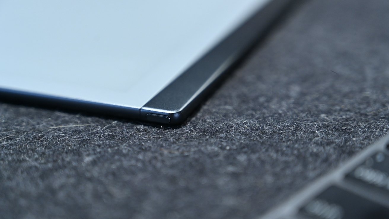
If you examine the tablet closely, you can see the little details. Take the power button, for example. It is located atop the spine of the tablet, and it fits in place perfectly with the slightest little chamfered edges that give it just enough differentiation between it and the edge of the tablet.
The tablet’s body is metal, which gives it some solid weight, though not too heavy at all. It just feels as if it has some substance and doesn’t feel cheap. By itself, reMarkable 2 weighs only .88 pounds.
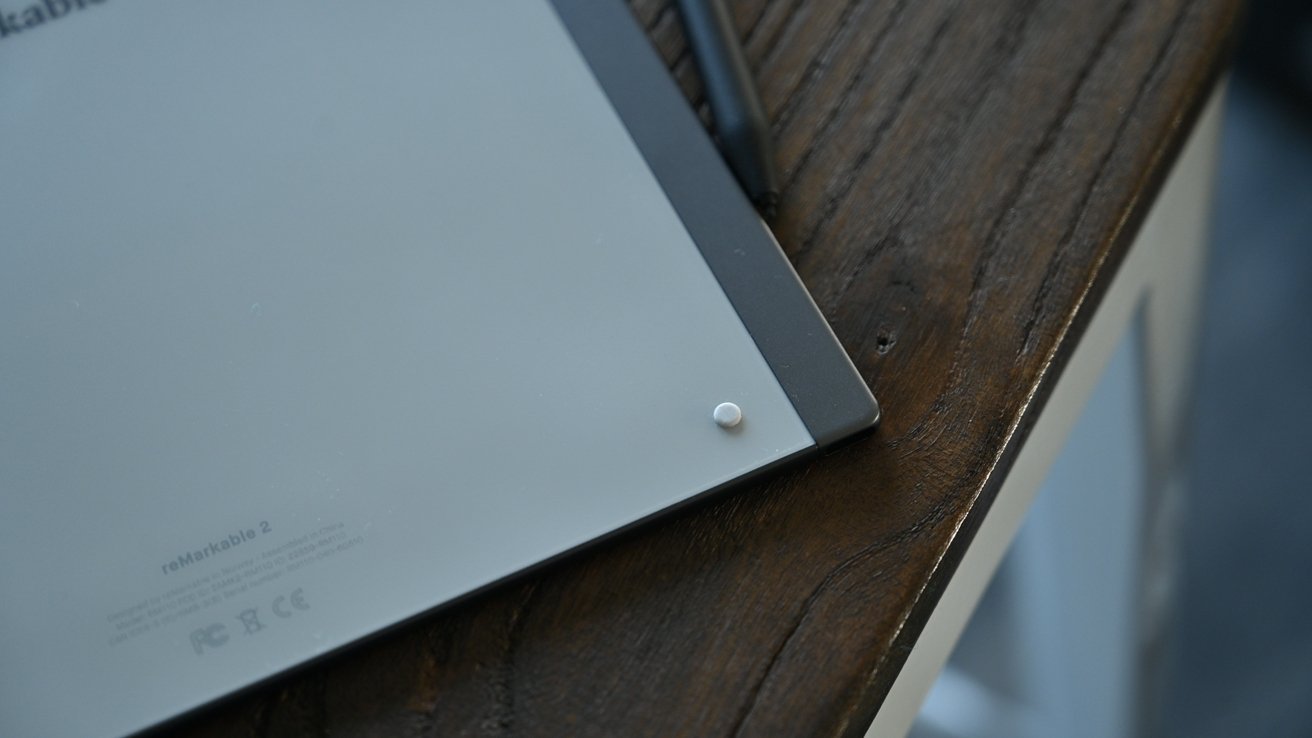
Rubber feet on the back prevent it from sliding on your desk
On the back of the tablet are four tiny rubber feet. Without these, the tablet would surely slide around your desktop. It’s again a small detail that is well thought out and done explicitly for notetakers.
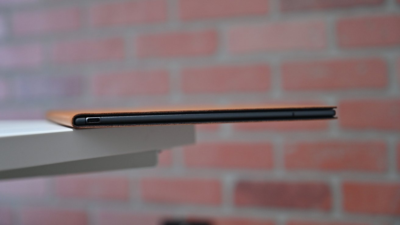
The reMarkable 2 tablet is as thin as the USB-C port that powers it
It’s also shockingly thin. So thin that it looks impossible to go any thinner. It’s about as thick as the USB-C port used to charge, measuring only 4.7mm. That’s an entire millimeter thinner than iPad Pro and 30 percent thinner than the last-generation reMarkable tablet.
Internally it’s powered by a 1.2 GHz dual-core ARM processor with 1 GB LPDDR3 SDRAM and 8GB of storage. That updated processor doubles the speed from the reMarkable 1. Its battery is three times that of the original, which will last two weeks on typical use.
It connects with the aforementioned USB-C port, but it also connects wirelessly with either 2.4GHz or 5GHz Wi-Fi bands.
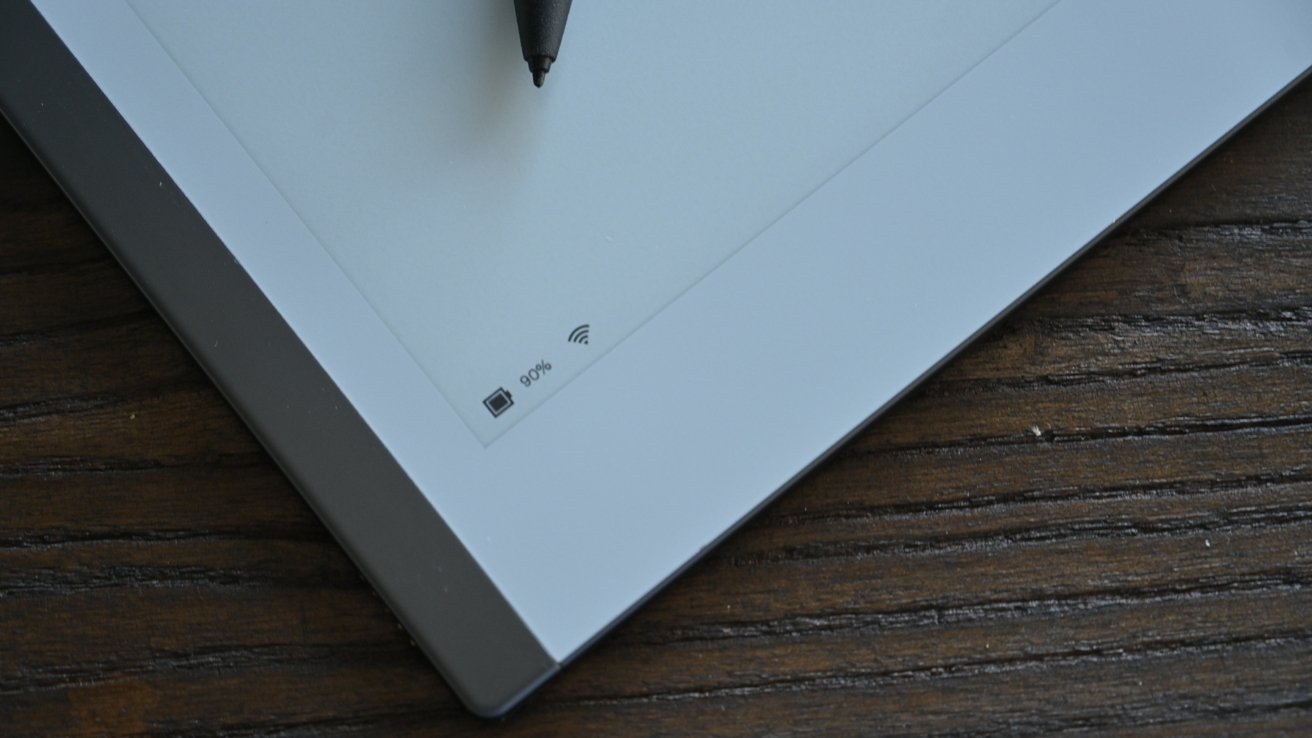
Battery status and Wi-Fi signal
The display is a lovely 10.3-inch display with 226 dots per inch (DPI) at 1872 by 1404 resolution. This is a second-gen CANVAS partially-powered E-ink display with Carta technology that looks better than the original. Using the reMarkable Marker, the screen can display 4096 levels of pressure.
Since this is all about the writing experience, it makes sense that E-ink display both looks and feels like paper. It has that matte finish that looks good in the sun, has little to no glare, and even makes the same sound as paper as you write.
Accessories
The display works with your fingers, but to write, and get the full experience, you will need one of reMarkable’s stylus options.
As an entry-level option, there is the Marker which comes in a soft gray color. It feels nice in hand, has a slightly textured exterior, and writes very pleasantly. Still, we think the better option is the Marker Plus.
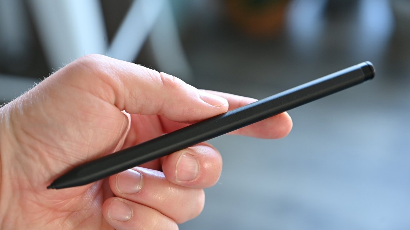
Marker Plus stylus
It has a bit more weight than the simple Marker and comes in black instead. What sets it apart most, though, is the ability to use the opposing end as an eraser. Just turn the Marker Plus around, erase whatever you just wrote by rubbing it against the screen, and your writing disappears.
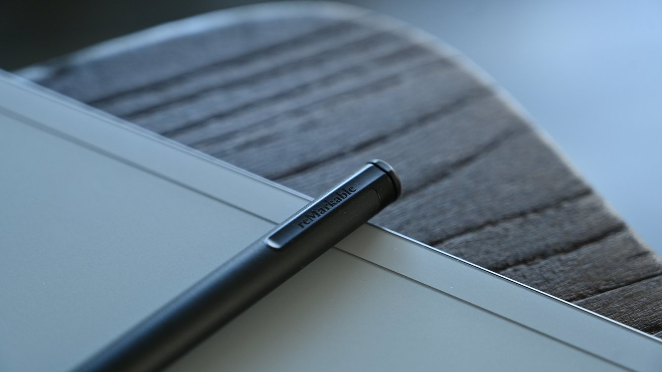
End of the Marker Plus
In another nod to the reMarkable 2 tablet’s ability to replicate actual writing, as you erase, you still see a faint outline of your text for a moment before the screen refreshes. It looks just like you erased a pencil line on a sheet of paper.
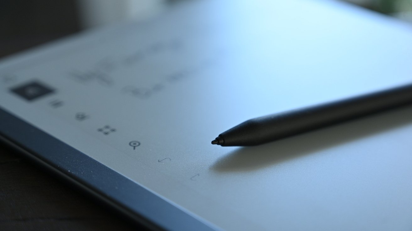
Tip of the Marker is replacable
Whether you opt for the Marker or Marker Plus, some things are shared, such as the swappable tips. The tips are consumables and will need to be replaced every so often. This is similar, again, to an actual pencil. As you write and take note with the tablet, the drag that creates that pencil and paper experience wears down that tip. A handful is included in the box, and more are available through reMarkable. They are very cheap, so it isn’t a concern and a worthy tradeoff for the feeling.
Something we see with lesser tablets quite often is the distance between the writing instrument and the display. This feels slightly unnatural as you see the stylus’ tip and then the “ink” a millimeter or so away. Here, there is very minimal distance, and it’s about as close as we’ve come to replicating the paper experience.
Each of these styli requires no charging and can magnetically connect to the side of your tablet for safety. It’s very similar to the iPad Pro and second-generation Apple Pencil.
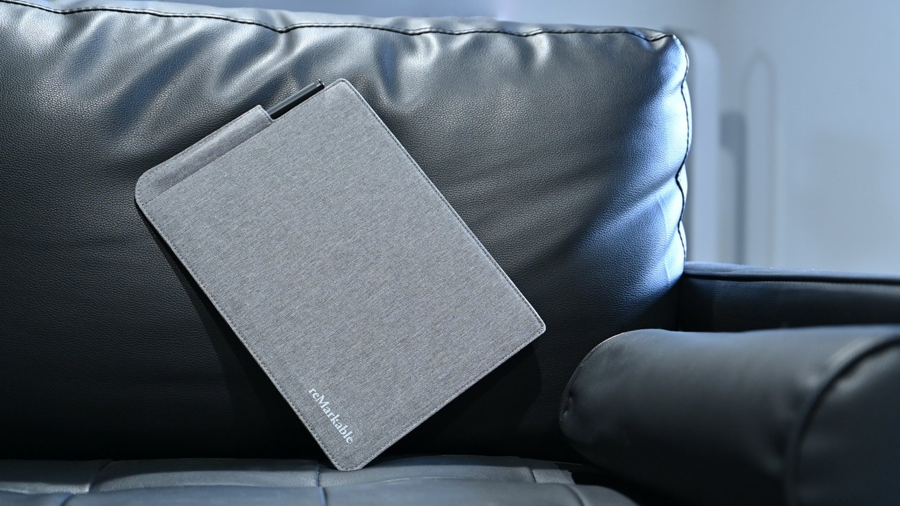
With something as nice as the reMarkable 2, you’d likely want to have some protection for it if you’re taking it outside the office or home. There are two first-party options to choose from — either the Folio or the Folio Book.
Folio for reMarkable 2
The Folio is more akin to a sleeve that the reMarkable 2 can slide into. It’s a fine, heathered grey fabric that is sturdy and durable while also staying very thin. On one side is a slot for the Marker or Marker Plus to sit. While the magnetic ability is cool and useful to stop it from rolling away, when you’re tossing it in a bag, it can still come free. By sliding it into the sleeve, it’s always safe.
Book Folio for reMarkable 2
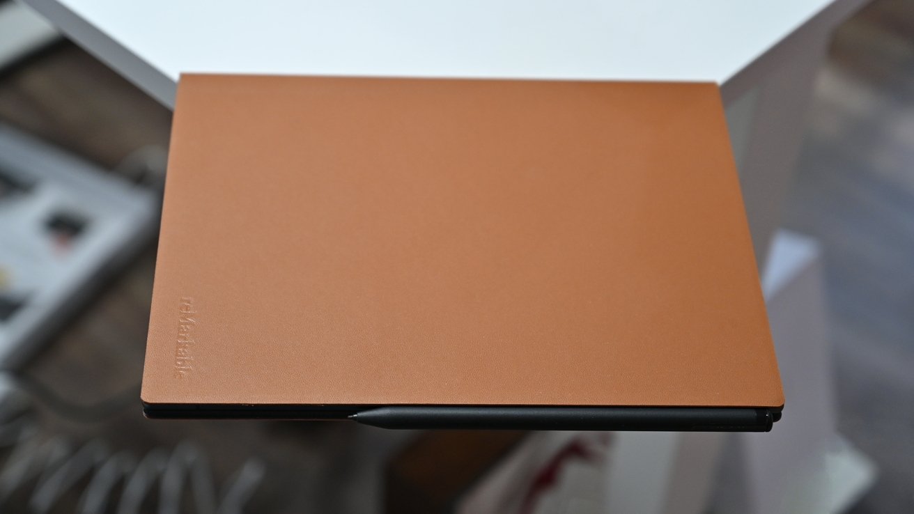
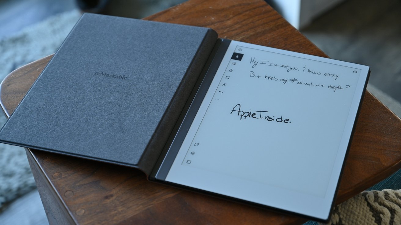
Above that is the Folio Book. This is not dissimilar to a leather cover on a traditional notebook. It magnetically locks into place so you can keep it attached while you use your paper tablet. It covers both the front and back and can be folded around the back while writing.
Book Folio for reMarkable 2
We picked up the brown leather, but a black leather option is also available. These fine leathers are minimally treated to take on a gorgeous patina with age. If leather isn’t your thing, another version made of heathered grey fabric is available.
The user interface
This tablet makes it easy to do what it does best — take notes. Just power it on from the small button on the top-left corner, and you’ll see the note you were on last or the main menu.
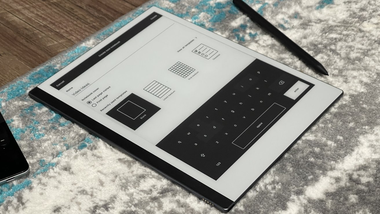
That main menu page shows all of your notebooks and files you’ve created. Three buttons at the top let you create a new folder, create a new notebook, or add a new quick sheet.
The battery level and Wi-Fi status are situated in the lower-left corner, a search button is to the top-right, and the menu button is to the top-left. The menu gives you access to just your notebooks, any PDFs you’ve loaded, any ebooks you’ve saved, your favorites, trash, and settings.
Navigate to any of your existing notes or notebooks you’ve started, but quite often we’d opt for the “quick sheets,” which, for us, are just spur-of-the-moment unorganized notes that we had to jot down.
Notebook options
When you create a notebook, there are dozens of various templates for both portrait and landscape. Storyboards, a planner, dots, grids, lines, and more are all possibilities. We very much appreciate the options here and the thoughtfulness of the layouts. It’s a big reason to choose a digital notebook rather than a paper one.
Each note has a hideable menu with a smattering of controls, mainly the ones you’d expect. reMarkable lets you change what writing utensil you are writing with, including a ballpoint pent, a fineliner, a marker, a pencil, a mechanical pencil, a paintbrush, a highlighter, or a calligraphy pen. Each writes differently and with a different style.
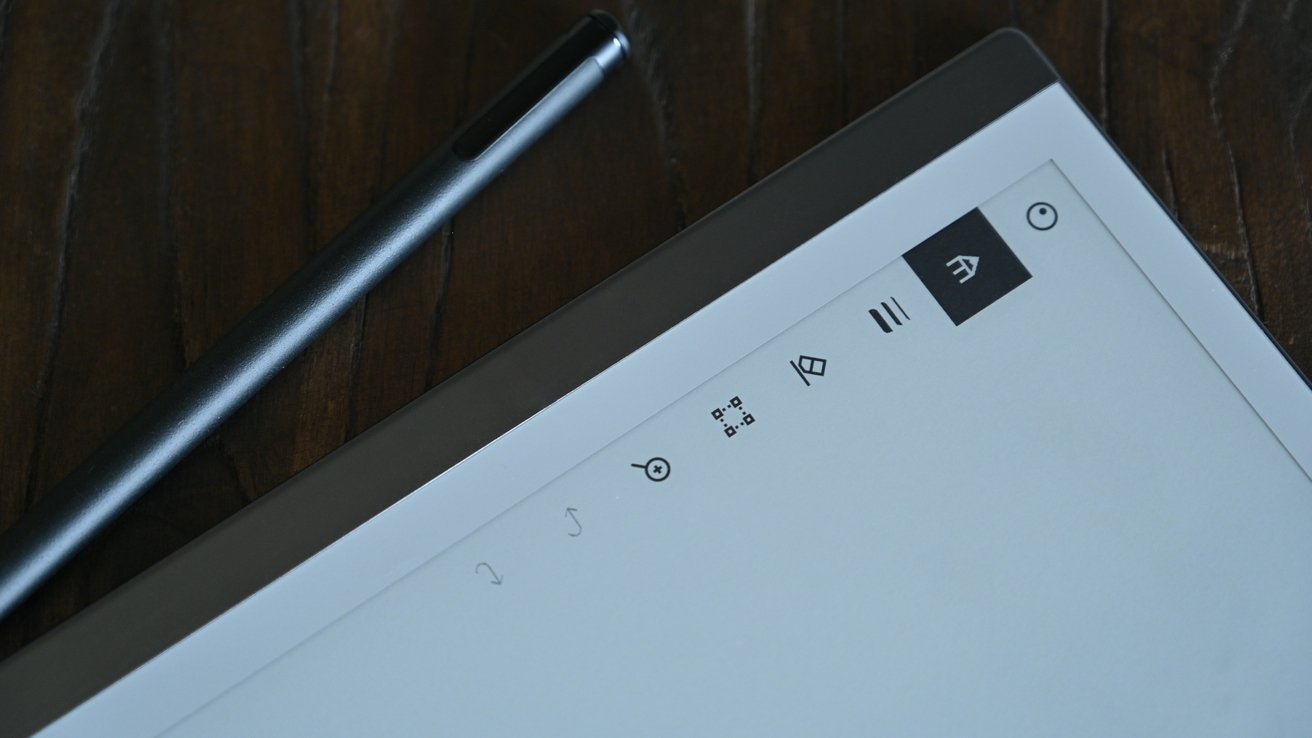
In-note menu
Those instruments can be black, white, or black and thin, medium, or thick in weight. Other tools include a marquee tool to select, an eraser, a magnifier tool, and undo/redo arrows.
At the bottom of the menu is a share icon that can send it by email or “convert to text and send.” It ends with the layers button and the notebook button.
When not necessary, the menu can be hidden, letting you focus on content.
The UI is overall easy to follow and understand and has a minimal learning curve to get the hang of.
We see reMarkable 2’s shortcomings in two categories — those that are relevant to note-taking and those that aren’t.
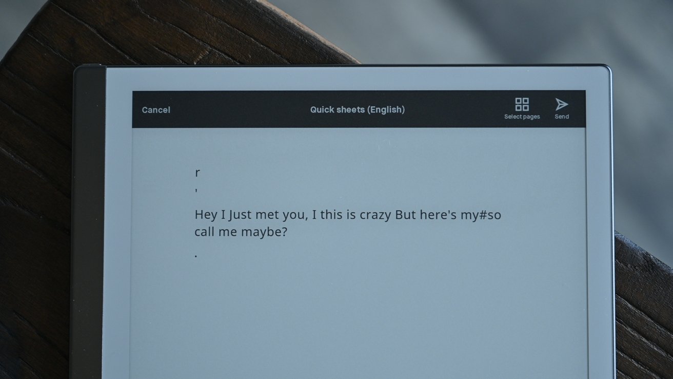
Handwritten notes on reMarkable 2
When it comes to taking notes, our biggest issue is its translation feature, which transcribes your handwritten notes into text and allows you to send them off. By design, it’s a great feature. Take notes during a meeting and then send typed notes out to everyone who was in attendance. But for us, it wasn’t all that accurate.
Perhaps it was our handwriting — which is far from great — but we wound up with a lot of errors. There were errant commas, new lines, and other issues that required quite a bit of editing. It is decent enough, but not something we could fully rely on without putting in additional work.
Another issue with note-taking was the search. There isn’t a good way to search your notes, which in truth, just kept us more organized as it was the only way to find what we needed in our notes.
Beyond note-taking, reMarkable 2 tries to do a few other things— some well and some not so well. For example, you could use the tablet as an eReader. Technically, it works for this, and the screen is perfect, but the interface is poor, and it only supports ePub with no DRM. Few people have DRM-free ePub files lying around. There are also no hardware navigation buttons, so you have to tap the screen each time to go to the next page.
If you want an eReader, go for a Nook or Kindle. PDFs, though, do work well on the tablet, and you can even annotate them.
One interesting feature that works on occasion is the Chrome plugin. Here you can save websites and news articles that you want to read later, and they will automatically load on your reMarkable tablet. If you want the text, this is great. But images or videos can get lost in the conversion and leave you jumping back to a browser for additional context.
Don’t replace your iPad, supplement it
Some may see reMarkable 2 as a replacement for an iPad. That could potentially be the case if your sole use of your iPad was for taking notes, but that use case is less than likely. Apple has endowed the iPad with more and more features of the years, and third-party apps have brought even more potential to the device.
The iPad line used to be very poor at note-taking but got much better when Apple introduced the Apple Pencil and Apple Pencil 2. Yet even then, it doesn’t hold up in this one category to reMarkable. To get close, you’d need a solid third-party app, a matte screen protector such as Paperlike, and of course, an Apple Pencil.
At that point, it still falls short. An iPad is heavier, it is thicker, it slides on a desk, and you’re constantly interrupted by notifications. Without notifications, you have the draw of a web browser or social apps that can tempt you and pull your focus from taking notes.
You can’t beat reMarkable for physically taking notes, and you can’t beat iPad for being a capable full-featured tablet. As much as it would be nice to have one device to do both, serious notetakers will inevitably have to rely on two devices.
One way the two can work together is the reMarkable app. This app, available on iPhone and iPad, syncs all your notes across. You can see all your notes and sketches from your reMarkable 2 tablet on your iPhone and iPad for further sharing and viewing. Makes it easy to take your notes and then pull them up on any other device when you need them. There’s even Mac support to see your documents there too.
We’ll repeat it — we love this device. But while we love it, we can’t recommend it to everybody. You have to take a lot of notes or sketch to make it worth it. The entire premise of the device is to elevate note-taking so if you don’t do that regularly, it is too high a cost to pay.
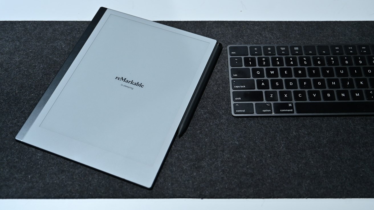
reMarkable 2 tablet on our desk
The accessories are as good as it gets with a solid feel, premium materials, and excellent features. The Folio Book is one of the best covers we’ve seen on a tablet hands-down.
We liked the original reMarkable tablet, but this second-gen device takes it to a whole new level with increased software support, twice the speed, USB-C, a better display, a thinner design, magnetic accessories, and a longer battery life.
If you take many notes and want the unequivocal best device for doing so, grab the reMarkable 2. But that isn’t going to be everyone. If the third-generation device does do a bit more, then maybe its audience will broaden.
- Top-notch build quality and materials
- Fantastic premium accessories
- Marker and Marker Plus don’t requie charging and Plus model has a built-in eraser
- Designed 100 percent with notes in mind
- Easy to manage and organize notes
- Mobile and Mac apps for syncing notes
- Chrome plugin for saving articles for offline viewing
- Many “paper” types for notes and notebooks
- Feels and sounds like writing on paper
- Very thin and fast
- Long battery life
- Much improved from original version
- Can annotate PDFs
- Expensive
- Ebook funtionality is poor
- Convert to text feaure isn’t great
- No cloud storage support
